

Salamon Planung – Rebranding, logo & website by allkind
Rebranding, logo & website for Salamon Planung.
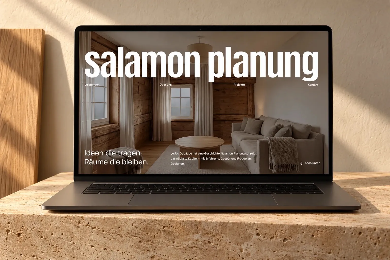
A planning office that writes a new chapter for old buildings deserves a presence with the same care.
The previous presence no longer matched the quality and attitude of the office. It needed a new website and a brand that grows with it.
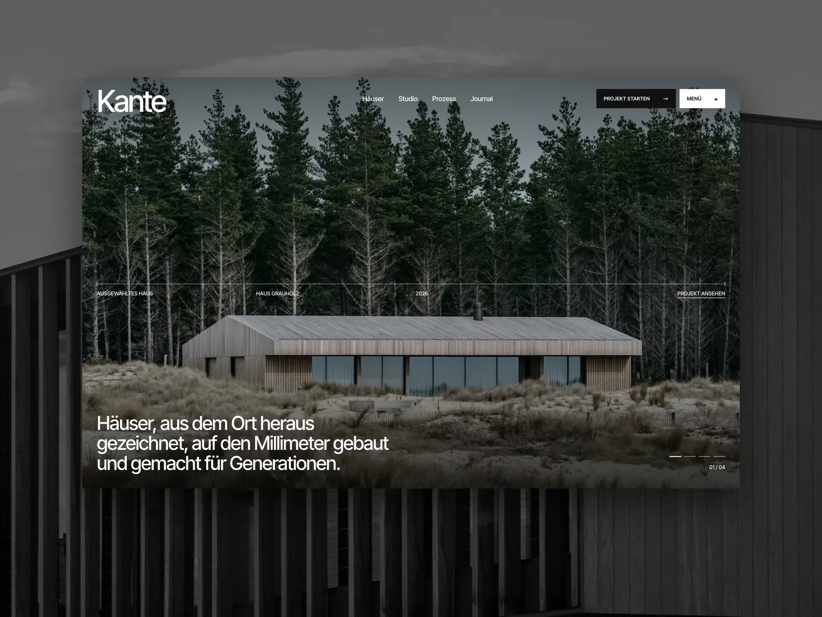
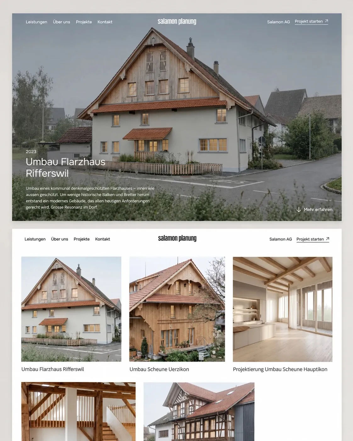
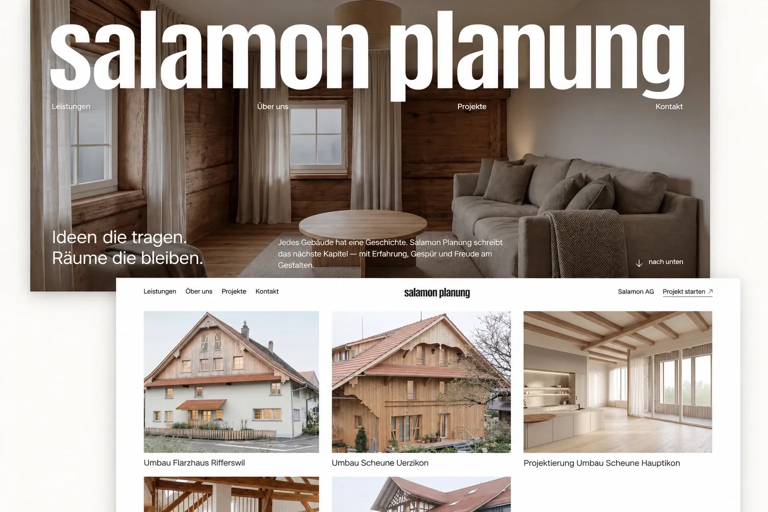
A rebrand with a redesigned wordmark and a website that shows projects large, calmly and with plenty of space.
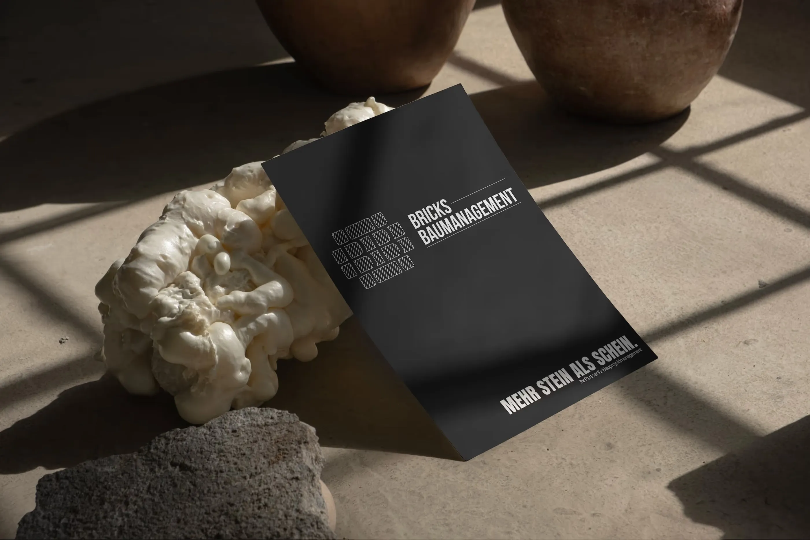
A contemporary, distinctive presence, consistent from the business card to the website.
Starting point
Salamon Planung converts, plans and brings old buildings into the present, often with lots of wood, history and craftsmanship. The office’s presence no longer did this work justice.
The request was for a new website. It became a rebrand: first sharpen the brand, then build the website on it.
Logo & brand
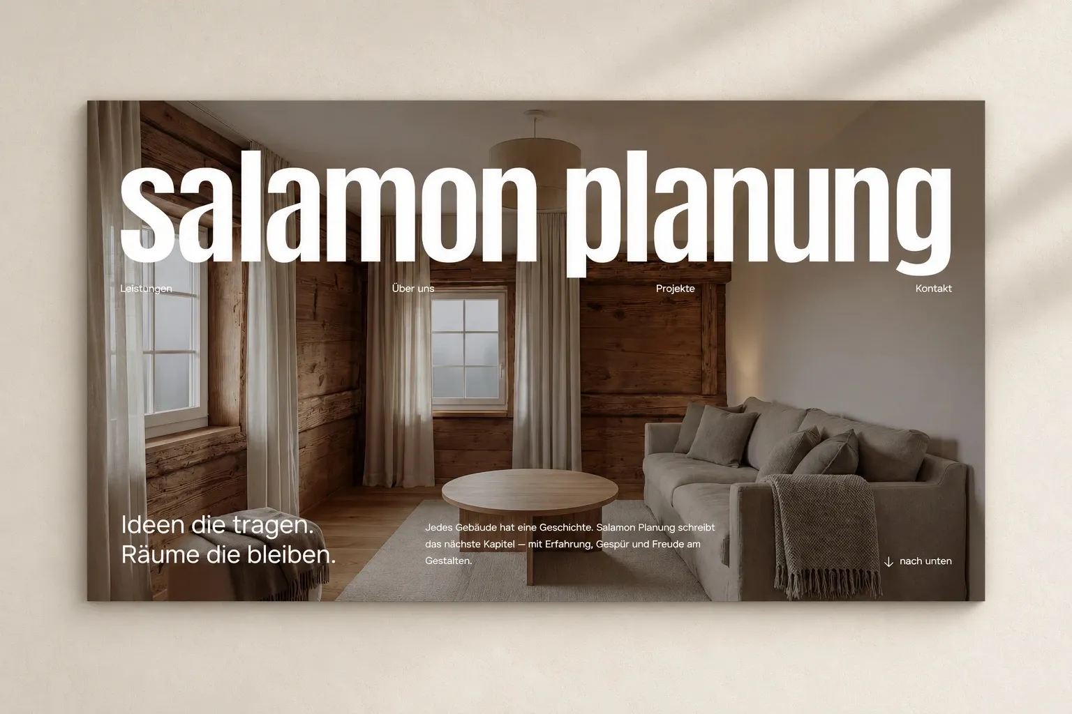
The new wordmark is narrow, strong and lower case. It looks confident without being loud, and works as well large over an image as on a business card.
Added to this are a reduced palette of black, white and warm natural tones and calm typography that gives the images precedence.
Website
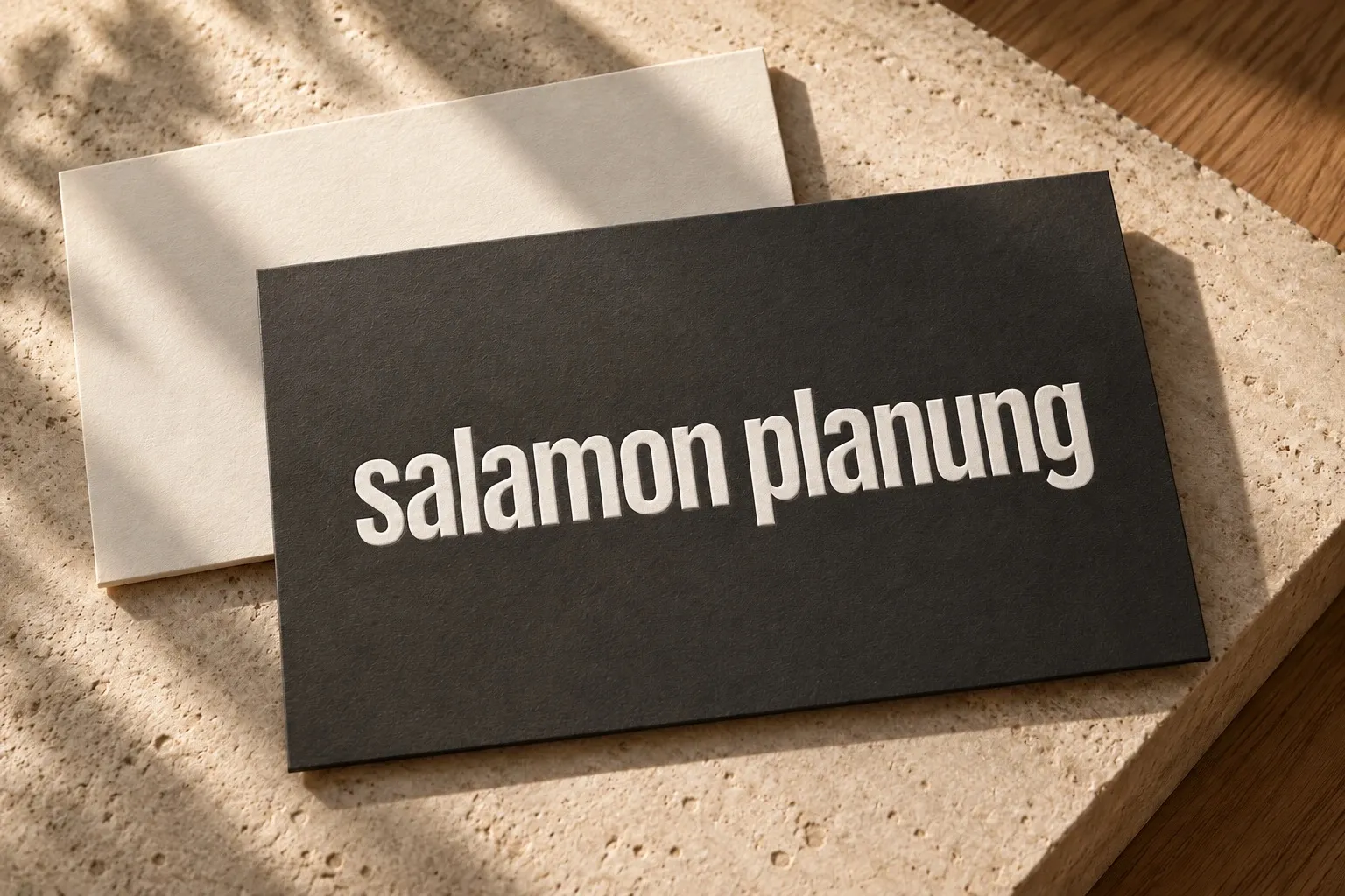
The website puts the projects at the centre: large images, short texts, clear navigation. Each reference tells the story of a building, from the listed Flarz house to the converted barn.
For visitors, “Start a project” leads straight to the enquiry from every page.
Do you want a presence that matches your work?
From logo to website: we develop brands that make your quality visible. Tell us what you’re planning.
- Answered personally by Mäx
- Free and without obligation
- Or directly: maex@allkind.ch