


fuga – Web design & art direction · Concept by allkind
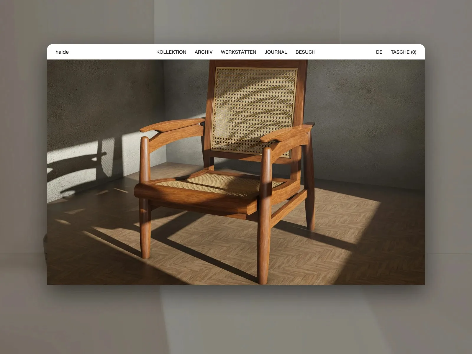
Web design concept for the kitchen maker fuga.
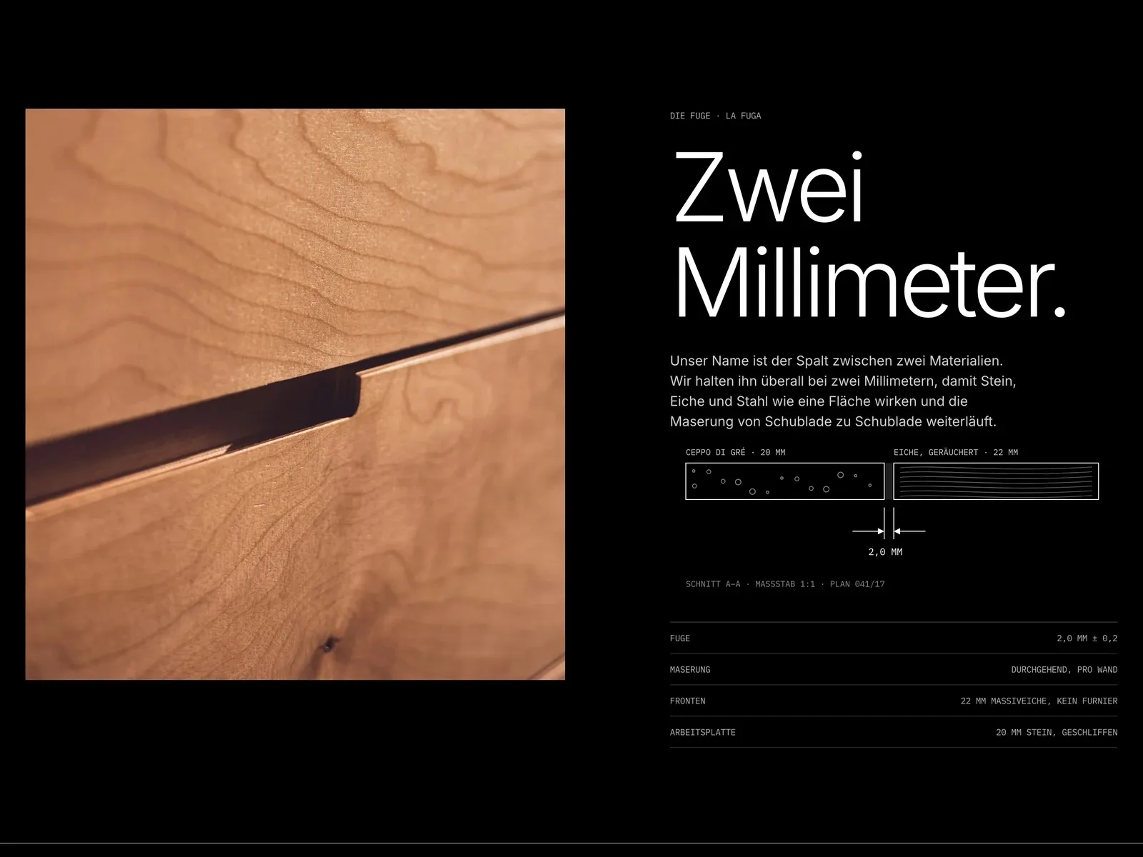
If you build to within two millimetres, you may as well show it.
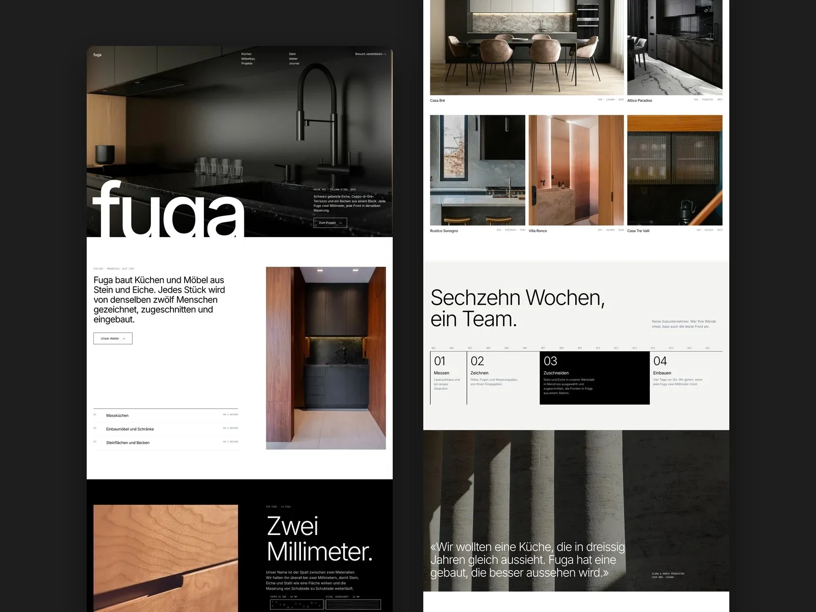
A kitchen maker in Ticino, named after the joint between two materials. The website should make that precision tangible.
Dark images with plenty of shadow, a large, calm grotesque and technical details in monospace, as on a section drawing.
A presence that feels like the kitchens themselves: few materials, cleanly joined, without a single superfluous detail.
The idea
fuga is our concept for a small workshop in Mendrisio that builds kitchens and furniture from stone and oak. The name is Italian for joint: the gap between two materials.
That is exactly where a kitchen comes across as either cheap or valuable. So we made the joint the main character of the website.
Two millimetres
Instead of claiming ‘the highest quality’, the page shows a section as on a workshop drawing: stone on the left, oak on the right, exactly two millimetres between them. Below that, a short table with tolerance, fronts and worktop.
If you care about details, you’ll find them. Everyone else simply sees that someone here works very precisely.
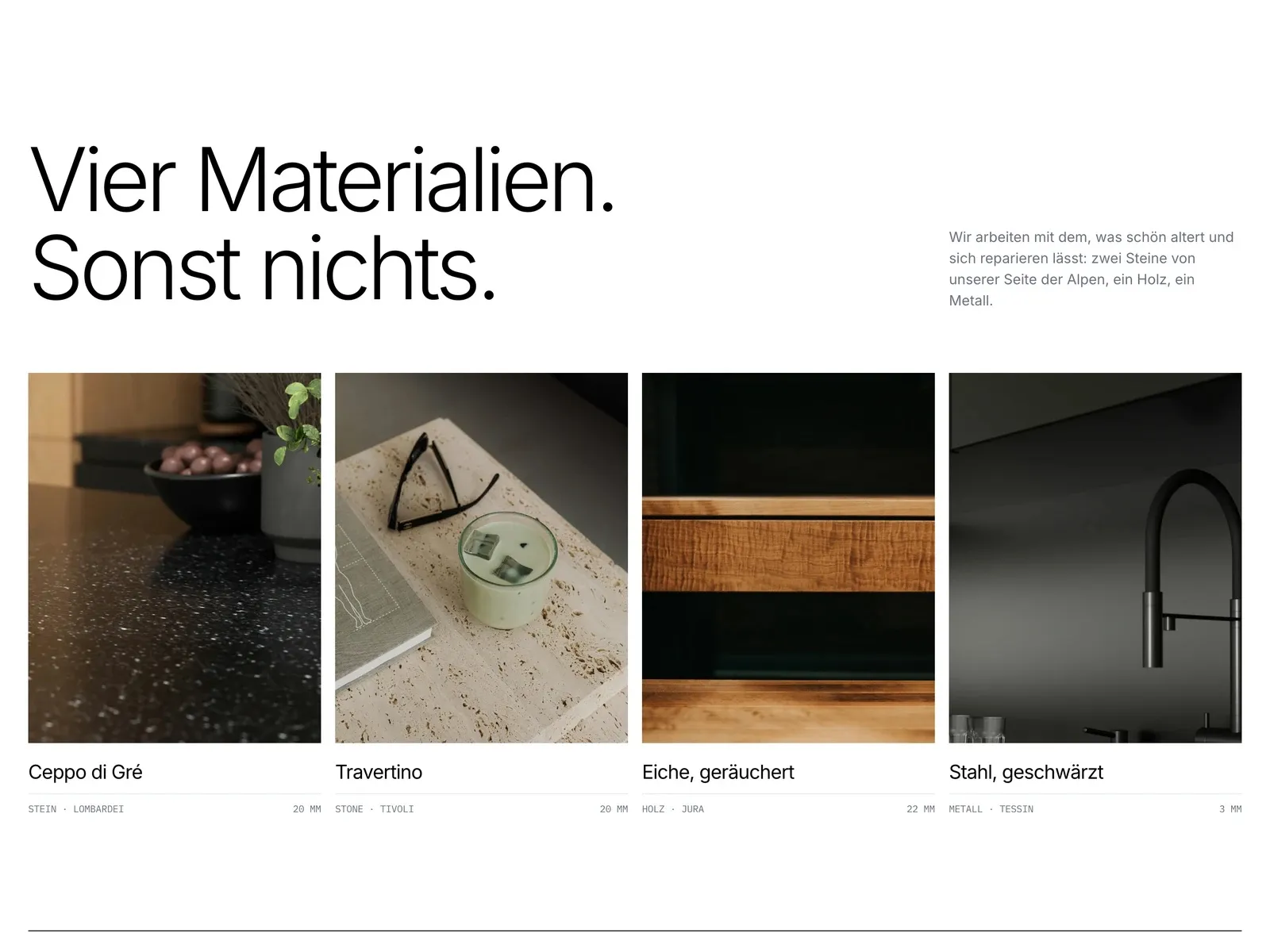
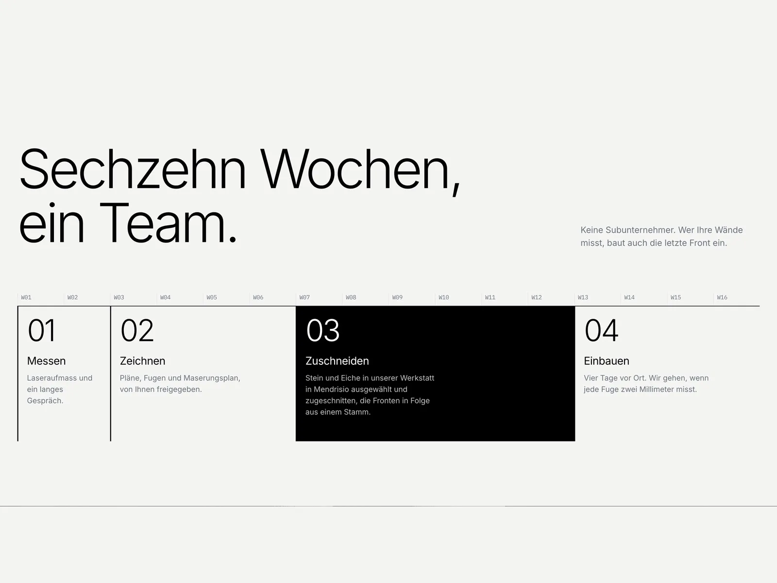
Four materials, sixteen weeks
The selection is deliberately small: two stones, one wood, one metal. Each material gets an image, its origin and its thickness in millimetres. Less choice makes the decision easier.
The process is laid out as a timeline over sixteen weeks, from site measurement to installation. So you know what happens, and when, before the first conversation.
«The best thing about a joint is that you don’t notice it.»

Is your craft more precise than your website shows?
We design websites that make quality visible without claiming it. Tell us what you’re planning.
- Answered personally by Mäx
- Free and without obligation
- Or directly: maex@allkind.ch